Wednesday, December 10, 2014

Evangeline Mary Daniell


I only know of one cover by Evangeline Mary Daniell, who also went by the signature "Eva," but it is such an exceptional Art Nouveau design that it's likely there are others to be found. Please do post a comment if you know of any. Her monogram EMD is on both the cover and dust jacket of the first printing of The Seven Seas by Rudyard Kipling, the first American edition, published by Appleton in 1896. The monogram was removed from the cover on the 1897 and subsequent editions, but remained on the jacket. Three copies were in the first exhibition of American Decorated Publishers' Bindings 1872-1929 (2005).

The design was issued in two variants in 1896, orange cloth and a smooth grey-green fine weave cloth. The orange variant was in the 2005 exhibition. An interesting aspect of this design is the darkened area within the seaweed.  On the grey-green cloth it appears to be accomplished by blind stamping. On the orange cloth, which has more texture, it appears to be stamped with varnish or a similar clear gloss finish.

 Evangeline Mary Daniell
The Seven Seas
by Rudyard Kipling
New York: D. Appleton and Company, 1896
[EMD monogram at the bottom center, detail below]


A  worn reference copy of the 1897 edition in olive green buckram was also in the exhibition, with its dust jacket quite chipped. No monogram on the cover, but it is on the dj:


and a copy of the 1899 edition in grey-green cloth:


Sunday, November 23, 2014

A previously unknown Amy M. Sacker cover


I am pleased to let you know that the entire exhibition of American Trade Bindings with Native American Themes 1875-1933 has been acquired by the Eberly Family Special Collections Library at Pennsylvania State University. This is the same library that acquired the previous exhibition, The Book Cover Art of Thomas Watson Ball.

It's been three months since the previous post—in addition to packing and delivering the books I was finishing my new work, Notes, which is a Featured Artist Exhibition at the Center for Book Arts in New York City through December 20. Also presented two talks and taught a Master Class there. 

Now that things are calming down, there is space again in the studio/gallery to open some of the cartons of books purchased from the Mercantile Library five years ago. They kept the covers in miraculous condition. Some volumes are pristine, as though they just came from the bindery. Even books that were read to the point of falling apart were re-sewn and cased into the original covers.

One exciting find was Amy M. Sacker's design on Sweet Peggy by Linnie S. Harris [Little, Brown & Company, 1904]. Like many of their rebound books, the replacement endpapers are acidic, have turned brown and are disintegrating, but this does not affect the cover art. Considering the amount of use this volume must have had, the design remains bright on the cover and spine, with just a few smudges that can be cleaned.


Amy M. Sacker
Sweet Peggy by Linnie S. Harris
Frontis.and illus. by Henry J. Peck
Chapter headings also illus with music notation
Boston: Little, Brown & Company, 1904, October
[AMS monogram in right stem between ribbons]

What's exciting about it? It's not just that it's a good cover design by an important artist, and one that adopts Thomas Watson Ball's style of clouds. This is a rare book. WorldCat shows just two copies, one in Special Collections at the University of Washington and one in Rare Books at the Huntington Library in San Marino, CA. Amy Sacker's work has been superbly documented by Mark Schumacher. If you've never clicked the link on the left to his Amy Sacker website, this would be a good time to explore it. Sweet Peggy was not in his list. I wrote to him. He was not familiar with it, so I sent him a photo.  He replied, "This is, for some reason, a very scarce title. Most libraries own a microfilm version of it !!" Mark is a librarian at UNCG, which has a fabulous collection of trade bindings, with over 1,800 in their Digital Collection.

I looked everywhere for another copy to see if I could find one with the original endpapers, and found one! But it has a different cover. Clearly a later printing, it has no date on the title page. Little, Brown used the same AMS spine design. Evidently they didn't want to spend the additional cost of stamping four colors, and used a design with just two. This printing has the same frontispiece, but not the additional illustration opposite page 220.


Amy M. Sacker
Sweet Peggy by Linnie S. Harris
Frontis. by Henry J. Peck
Chapter headings also illus with music notation
Boston: Little, Brown & Company, ©1904

Why is this book so scarce? We know of only three extant copies with the AMS cover (assuming the two others have the original cover in good condition) and just this one copy of a later printing.  What happened to all the others?  Clearly it was a popular book—the Mercantile copy was read so much it needed rebinding, and sales were strong enough to do at least one other printing. 22 libraries have the microfilm of it, and one library, OSU, has a microform of an A. L. Burt reprint, though no physical copies of that edition are listed anywhere.

Monday, August 18, 2014

Fulfillment +

All pre-publication subscriptions for American Trade Bindings with Native American Themes 1875-1933 have been shipped. Below is a photo of the Deluxe edition:

Book covers with Native American Themes 1875-1933Deluxe Edition
While cataloging this collection many books have arrived. Here's one on the same theme, that arrived too late for the exhibition:

Iroquois
by Samuel P. Moulthrop
Illustrated and Arranged by Sadie Pierpont Barnard
Rochester, NY: Ernest Hart, Publisher
1901
[unsigned cover in the style of the illustrator]


Monday, June 23, 2014

American Trade Bindings with Native American Themes 1875-1933


The new book is finished, and you now can LOOK INSIDE! (PDF) to read a few pages. For more  information about the editions and ordering copies, please visit the web page for American Trade Bindings with Native American Themes 1875-1933.


Cover artists include Margaret Armstrong, Frank Hazenplug, the Decorative Designers, Thomas Watson Ball, Angel de Cora, Bright Eyes, and many others. With the illustrators and dust jacket designers, a total of 87 identified artists are in the exhibition.

In addition to Tribal art, the covers include the evolution of Modernism from late Victorian through Eastlake, Arts & Crafts, Art Nouveau, Poster style, and Art Deco.

There are decorative, symbolic, and pictorial  covers depicting cultures from the Arctic to South America, and times from prehistoric to the early 20th century. It includes captivity narratives, autobiographies, frauds, ethnographic works, myths, travelogues, propaganda, songs, dance, romance novels, and juvenile fiction.

Tuesday, April 1, 2014

Two Rare Balls from Dodd and a Newly Discovered One from Small, Maynard

 
Many covers by Thomas Watson Ball have been featured here. Type Ball into the Search box to the left and you will find them. Two designs that had eluded me for many years turned up recently. How did I know to look for them? Both are in the Ball Portfolio at the University of Rochester
     Autobiography of a Child appears exactly like the portfolio panel:

Thomas Watson Ball
Autobiography of a Child by Hannah Lynch
Dodd, Mead & Company, 1899

The Conquest of Charlotte, however, is indigo-grey cloth stamped in green and white, while the portfolio panel is russet cloth. Since the portfolio panels are only the stamped cover cloth with no boards or spines, they are likely publishers' proofs sent to Ball for approval. Perhaps there was a run of the edition in russet, or maybe only the blue was issued.  Did Ball reject the russet and call for this color combination? Unless a russet copy turns up we may never know. If you find one, please post a comment!


Thomas Watson Ball
The Conquest of Charlotte by David S. Meldrum
Dodd, Mead & Company, 1902 

 Thomas Watson Ball 
The Conquest of Charlotte by David S. Meldrum
The Thomas Watson Ball Portfolio
University of Rochester
River Campus Libraries
Rare Books & Special Collections

New to me, with thanks to Chris Kraus, is By-Ways of War, a fabulous  Ball design. It's not signed, nor in the portfolio, but it has all the Ball elements--the panel style, lettering, striated sky, ship silhouette, and dramatic waves. The interesting thing is that Chris found a copy issued by Small, Maynard in 1901.  I could not locate one of those, but found and ordered a copy issued by Sherman, French in 1907.  When it arrived I was pleasantly surprised to see that it was the 1901 Small edition, but the title page had been excised and replaced by tipping a new one onto the stub. The spine says Small, Maynard & Co, and the ads in the back are for Small Maynard editions of 1901.


 Thomas Watson Ball
By-Ways of War by James Jeffrey Roche
 Small, Maynard and Company, 1901
with the title page replaced by Sherman,French & Company, 1907


 Particularly exciting is the ad that Chris had previewed for me identifying T.W. Ball as the cover designer of Visiting the Sin.


Sunday, March 30, 2014

Peacocks

http://americanbookcovers.blogspot.com/2009/08/iconic-book-cover-from-1876.html 
The first post to this blog in August 2009 was about a book with a peacock feather stamped in gold on the cover, The New Day by Richard Watson Gilder [Scribner, Armstrong, 1876]. It's worth re-reading that story, because there is a connection to Margaret Armstrong, whose peacock designs are below. Here's a photo of that book to refresh your memory. Click it to read the original post.
      Peacocks and peacock feathers were a pervasive image of the Aesthetic Movement, a symbol of beauty in nature. Whistler's Peacock Room of 1877 was a monumental tribute to this theme.
     Albert Angus Turbayne is sometimes thought of as a British designer, but he was a native of Boston, born in 1866. He lived and worked in England for much of his career, and was considered among the top book artists, creating designs for trade bindings and fine bindings with gauffered edges. The September, 1900 edition of The Artist [vol. 28, No. 248, pp. 212-217] has a nice illustrated feature titled "A. A. Turbayne's Book-Bindings at the Paris Exhibition" that will give you a sense of his work and stature at that time. Look particularly at the "'Maiolica' fore-edge by A. A. Turbayne" on p. 215.
     His most familiar work is an Art Nouveau peacock binding done for Macmillan's series of books by Thomas Love Peacock.


A. A Turbayne
Gryll Grange by Thomas Love Peacock
London and New York: Macmillan & Co., 1896

     The stamping die is engraved with fine lines that reflect at different angles, so parts of the image light up differently as you move past the book or turn it in your hands.  This is a variant of the technique that lit up the 1876 cover of The New Day.


     Turbayne was a master at monograms, and was the primary designer/artist of the book Monograms & Ciphers [London: T.C.& E.C. Jack, 1906]. At various times he worked for the London County Council School of Photoengraving and Lithography, for Carlton Studio, and as a book designer for Oxford University Press. His own cipher is:


     Like many book cover designers in this period, the British artist Paul Woodroffe was also an illustrator and worked in stained glass.  For the Pre-Raphaelite writer Gertrude Hudson's romanticized tour of India that took a scathing look at British imperialism (writing as a man under the pseudonym Israfel), Woodroffe created a not-quite repeat pattern with two peacocks:

Paul Woodroffe
Ivory Apes & Peacocks by Israfel (Gertrude Hudson)
New York, London: P Mansfield & A Wessels; At the Sign of the Unicorn, 1899

     Margaret Armstrong, perhaps the most collected American book cover artist of the golden age, was also a stained glass designer, having studied with John LaFarge (as did Sarah Whitman and Alice Morse). She made a horizontally symmetrical peacock design in 1903 for Appleton's book on housekeeping for the wealthy. This cover uses bright and matte gold to achieve a lighting effect similar to the engraving on Turbayne's design, but here it is achieved by texturing the matte gold rather than hand engraving lines.


Margaret Armstrong
Millionaire Households by Mary Elizabeth Carter
New York: D. Appleton & Company, 1903

    She reprised the concept a decade later for Crowell:

Margaret Armstrong
Twenty Centuries of Paris by Mabell S.C. Smith
New York: Thomas Y. Crowell Company, 1913


Saturday, March 22, 2014

The Vedder Rubaiyat

 
A milestone among publishers' bindings is the Rubaiyat of Omar Khayyam, translated by Edward FitzGerald and illustrated by Elihu Vedder  [Houghton, Mifflin, 1884]. This book brought Pre-Raphaelite aesthetics and modern Symbolism into the American home. Vedder (1836-1923) also designed the cover, which was dramatically of its time and beyond. he included notes within the book about the creation of his illustrations. Regarding the cover, he wrote:
The swirl which appears here, and is an ever-recurring feature in the work, represents the gradual concentration of the elements that combine to form life; the sudden pause through the reverse of the movement which marks the instant of life, and then the gradual, ever-widening dispersion again of these elements into space.
Elihu Vedder
Rubaiyat of Omar Khayyam
Translated by Edward FitzGerald
Illustrations and notes by Elihu Vedder
Boston: Houghton, Mifflin and Company, 1884
44.5 x 38.5 cm 

Spine

     This is a very large book (17.5 x 15.25 inches), bound at Riverside Press in brown goatskin, stamped in gold and black. It was issued in an edition of 100 copies and instantly recognized as a masterwork. It sold out in less than a week, despite the then enormous price of $100.00. Houghton simultaneously issued a smaller cloth-bound "trade" edition for $25. At that time an ordinary illustrated book with a stamped decorative cover using genuine gold was $1.00 to $1.50.
     You can read all about the book and see the original art for every page, including all Vedder's notes, at the Smithsonian American Art Museum website.

     The insides of the covers are elaborate as well, with gold tooled dentelles creating a border for carded satin doublures printed with Vedder's design:


     The title page:

     Each spread is on a tabbed guard, with the images, printed by the albertype process, mounted on one side of each sheet. This edition is from "remarque" plates, which include a small image in the corner of each illustration. This is the only edition with remarque proofs.


       Houghton  issued many reprint editions as the years went by, all in cloth, each smaller in scale than the previous one, and a slightly different shape. The cover design was adjusted to fit each new format, and cheaper methods of printing brought the price down to reach a wide market.


Thursday, March 20, 2014

Two more by Gookin

As you saw in January, Frederick W. Gookin was fond of repetitive and symmetrical design. Here he used American eagles and revolutionary war hats to symbolize the content of A Yankee Volunteer by M. Imlay Taylor. In this design his monogram is clear and prominent.

Frederick W. Gookin
A Yankee Volunteer by M. Imlay Taylor
Chicago: A.C. McClurg and Company, 1898


The following year he designed another ornate symbolic Taylor cover for McClurg:

Frederick W. Gookin
  The House of the Wizard by M. Imlay Taylor
Chicago: A.C. McClurg and Company, 1899
Also issued with this design on green cloth

Sunday, March 16, 2014

Variant Covers with Native American Themes


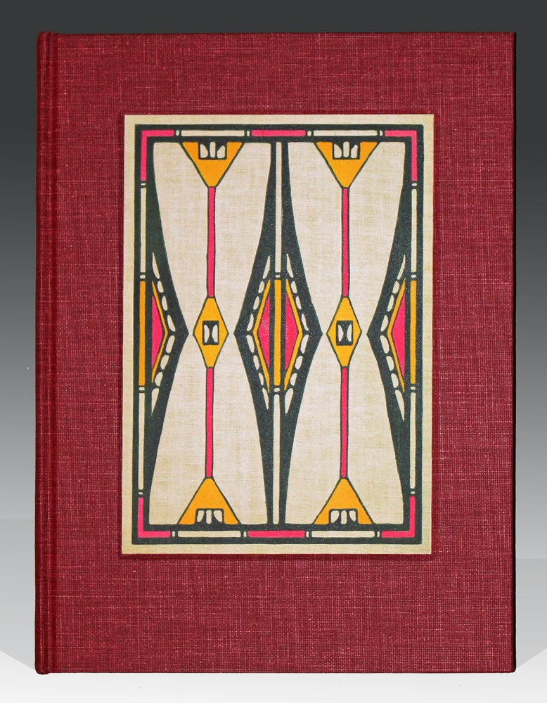
The current exhibition of Native American themed bindings has 116 different designs and 25 variants. One of the great designs that was ahead of its time is Florence Lundborg's 1904 cover for Yosemite Legends by Bertha Smith. It shows the influence of Albert Pinkham Ryder, and of Whistler, at whose short-lived Paris art school she spent the winter of 1899-1900.  She had previously studied in San Francisco with Arthur Mathews at the California School of Design. Mathews, who had studied architecture with his father before attending the Académie Julian in Paris, was a strong proponent of the Arts and Crafts aesthetic. Here the mists of Tonalism are gone, but the abstraction to simplified elements remains, with the totemic border rendered in Arts and Crafts style. Variant copies of the same edition are on green and russet buckram.


Florence Lundborg
Yosemite Legends by Bertha H. Smith
San Francisco: Paul Elder, 1904

Florence Lundborg
Yosemite Legends by Bertha H. Smith
San Francisco: Paul Elder, 1904

Margaret Armstrong often created variants of her bindings. For two titles by Washington Irving she made different covers with the same spine design, with variant cloth and stamping colors for each. The current exhibition includes this display of the four two-volume sets:


Margaret Armstrong
Astoria by Washington Irving
New York and London: G. P. Putnam's Sons, 1897, Tacoma Edition
and
The Adventures of Captain Bonneville U.S.A. by Washington Irving
New York and London: G. P. Putnam's Sons, 1898, Pawnee Edition

The cover of The Indians' Book, a volume of songs, stories, photos and artwork from many Indian tribes, collected and recorded by Natalie Curtis, was originally issued by Harper in 1907 in an unsigned binding. Most likely the cover was done by Angel de Cora (Hinook Mahiwi Kilinaka), a Winnebago from Nebraska born in 1871 who studied art at Smith College, illustration at Drexel, and at Boston's Cowles Art School. She did (and signed) the title page, and also did the lettering on the additional title pages that precede each section of the book. 
     A slightly revised edition was issued in 1923. This edition contains some additional drawings, photos and other material, but not all the additional songs that Natalie Curtis had planned to include in it. On October 23, 1921 she was hit by a car while crossing a street in Paris and died almost instantly. The cover uses the same design in a different color scheme. 

 Angel de Cora (Hinook Mahiwi Kilinaka)
The Indians' Book, Recorded and Edited by Natalie Curtis
New York and London: Harper and Brothers, 1907

 Angel de Cora (Hinook Mahiwi Kilinaka)
The Indians' Book, Recorded and Edited by Natalie Curtis
New York and London: Harper and Brothers, n.d., ©1923
This copy with the publisher's printing code L-E (November, 1930)  

The variant cover for the 1936 reprint of  Blankets and Moccasins is particularly interesting because it uses an overprinting technique with semi-transparent inks to create additional colors. The first edition of 1933 includes a lengthy colophon, but only indicates that the cover design is from an Indian blanket.


Indian blanket design
Blankets and Moccasins by Gwendolin Damon Wagner and Dr. William A. Allen
Caldwell, Idaho: The Caxton Printers, Ltd., 1933, September

Indian blanket design
Blankets and Moccasins by Gwendolin Damon Wagner and Dr. William A. Allen
Caldwell, Idaho: The Caxton Printers, Ltd., 1936, December


Detail showing indigo, red, and overprinting

The enlarged detail below includes a black letter from the title. Using a less viscous, more transparent ink for the indigo would create this effect, with the ink flowing into the crevices more readily and being more transparent on the elevated parts of the weave. By using a kiss impression and greater viscosity for the red stamping, the fine texture of the cloth would be maintained and more of the red would stay high on the weave, allowing the indigo to run into the valleys. The black title is stamped with a slightly deeper impression than the blanket pattern, somewhat flattening the weave. 


For more images of covers in this exhibition and information about the catalog, click here.
  

Wednesday, January 15, 2014

Frederick W. Gookin

 
When trying to learn more about F. W. Gookin, the first few biographical notes I found did not even mention his work as a book cover designer. I thought, "Maybe this Frederick William Gookin (1853–1936) is the wrong one." 

He was the Buckingham Curator of Japanese Prints at the Art Institute of Chicago, where he is described as "a lifelong Chicagoan."

Another bio presents him as a banker who was born in Ludlow, Vermont, was the Assistant City Treasurer of Chicago in 1901, served as Secretary and Treasurer of the Chicago Literary Club from 1880-1920 and as its president in 1921. "He presented twenty-one papers during his nearly sixty years of membership. One of them—Our Defective American Banking System: A Diagnosis and Prescription, presented November 2, 1908 —was published by the Club."

The first Gookin binding I acquired was on a self-published 1893 cookbook created for the World's Columbian Exposition in Chicago. It was in the Second Exhibition.


Frederick W. Gookin
Favorite Dishes: A Columbian Autograph Souvenir
by Carrie V. Shuman
Illustrations by Mary Root-Kern, Mellie Ingels Julian,
Louis Braunhold, George Wharton Edwards
Published by Carrie V. Shuman, Chicago, 1893, Second Edition
Printed by R.R. Donnelley & Sons Co.

In the Third Exhibition we had this one:


 Frederick W. Gookin
 Uncanonized
by  Margaret Horton Potter
A. C. McClurg & Co. ,  Chicago,  1901, Sixth Edition

Another by the same author, a year later, is on a shelf, not yet exhibited. It has an almost invisible monogram, similar to the one above, blind stamped in the border, that can only be seen in a strong raking light. Thanks to John Lehner for finding it.


 Frederick W. Gookin

Istar of Babylon
by  Margaret Horton Potter
Harper & Brothers, New York and London, 1902